A number of visualization are provided for the examination of gene expression information
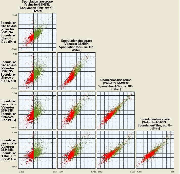
Scatter plots are provided for examining covariance (bivariance) between the experimental data sets (by taking n-projects through the data and showing these as a series of scatter plots)
Histograms are provided for looking at the distribution of the data
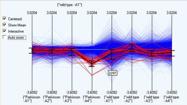
Parallel projections to show all the the expression profiles.
There are a number of common techniques that are used to visualize multi factorial (n-dimensional) data, broadly speaking these breakdown into either dimension reduction (typically using concepts to project the data down to a lower number of dimensions) or projection techniques such as n-dimensional scatter plots (or parallel projections). This visualisation use a series of 2D scatter plots to show all the possible ‘splices’ that can be taken through an n-dimensional space. A scatter plot is a useful interactive tool due to both its familiarity and simplicity, and because it shows the relationship between two different factors (making it possible to visualise outliers and general correlations).
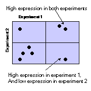
By plotting 2 dimensional slices through an n-dimensional space, we can project complex multi factorial information onto a 2 dimensional display. N-dimensions can be projected down onto sum(n-1) plots. By applying brushing to these plots it is possible to use them to identify correlations in other dimensions. In the illustration below all the genes that are highly expressed in experiments 1 and 2 have been selected, and have been shown in red. It is then possible to see how these genes behave in all the other experiments.
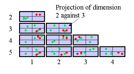
In SeqExpress when choosing to view a scatter plot it is possible to select a sub set of experiments (or concept defined projections) to display For example below shows the results of a 5 time series data experiments, with all the genes that have low expression levels at 2hrs selected. It is possible to see how over time the patterns of the genes expressed changes, whilst there are general correlation between the different gene expression profiles, the outliers and major transitions can be seen (the significant shift from 2 hrs to 5 hrs).
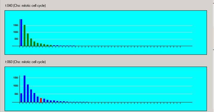
Histograms are available which show the distribution of gene expression levels in the different experiments. The distributions are created by dividing each of the intensities of an experiment into 50 bins, this means that a distribution banding in one histogram does not have the same interval in a second histogram.
Any selection in one histogram is echoed in all the others, as well as any other currently open visualisation. A selection in a histogram is shown in red, it is possible to multi select intervals using shift/ctrl combinations. If such a gene subset is selected, then any interval in other histograms that matches at least one gene is coloured green. The intervals are only labeled if there is enough space on the screen. It is possible to copy the selected subset of genes by either choosing the copy selection option in the edit menu, or by right clicking. For further information see Gene Lists
Parallel plots project n dimensional data down to 2 dimensions by taking the orthogonal axis and plotting them in a sequential parallel pattern. This is useful as it shows overall trends within the data over any number of dimensions. Any selection in this view is propagated to any other open visualisation. It is also possible to select items directly within a parallel projection, and then save the items as a new selection by right clicking and choosing "copy selected"
A number of options are available to aid in the exploration of the data: